Seeking the perfect theme
The CAC has recently been abuzz with our spiffy new upgrade to WordPress 3.8 which promises better mobile device compatibility, modern and colorful design and even a nod to a jazz great. Scott tells you all you need to know over in the Codex.
The featured theme for this update is Twenty Fourteen, and it is as beautiful as raved about here, here and here. Even the creator toots his own horn! Scott’s more measured review, in the Codex, notes some drawbacks, most notably the lack of an animated slide. For me, that was the least and last of its problems. As the admin of a Grad Center Commons site that mostly exists to spread the word about events, fellowships and jobs, and professional development advice designed to get our PhD students connected with their professional world, I need content to be king. Beauty is only screen deep!
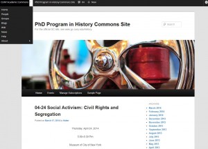
I began the blog with what was, and still is, the CAC default theme – Twenty Eleven. Here’s a screen shot:
This was a great starter theme – easy to use, clean and clear. But the enormous header graphic (and I have no idea why it has now defaulted to a giant wheel – fate?) simply took up too much space, compelling the users to scroll down to each posting. Given that most of my viewers were reluctant to initially switch over to the opt-in model of going to a website – as opposed to automatically receiving messages from the History Program’s longstanding listserv, straight from my Outbox, into Trash cans throughout the community – I felt strongly that I had to get the words higher.
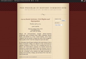
Next up, Quentin:
This served me well for a long time. It looks like a book, and an old-fashioned one at that. (And to entice some faculty members who were still proving reluctant, I sent them the link to this reminder that ALL technology takes getting used to.*) Readership went through the roof, though I must attribute this more to the incessant cheerleading Huber and I than to any seductive design.
But event after event after event conspired to make me try Twenty Fourteen. On Valentine’s Day, 2014:
Where to begin? I was mystified by the sruper-wide white margins and the squished pictures. I was grievously displeased by how different the theme looked on various browsers. Most of all, I was dismayed by how little text appeared on the screen. This “magazine style,” coffee table book type of theme just didn’t meet my needs.
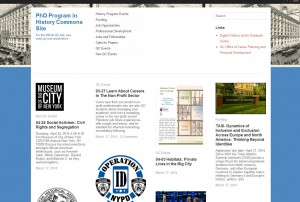
Thus began a frantic search which ended in :
The theme is called Imbalance 2, which is a misnomer because it balances most of my needs very well. It allows for lots of graphics but still easily enables the viewer quickly take in a lot of information.
More thoughts coming soon!
– Marilyn Weber
Academic Program Coordinator for the PhD Program in History
https://historyprogram.commons.gc.cuny.edu/
CUNY Academic Commons Community Facilitator
Postscript: And this was even before this piece of Norwegian comedy


