Bringing the New Profiles to Life
To improve is to change, so to be perfect is to have changed often.
While the CUNY Academic Commons is by no means perfect,it is in this way, through change, that the Commons Team strives for perfection. Our latest major change is the addition of the portfolio page to Commons members’ profiles. This change has a dramatic new visual design that removes most of the Commons related branding and navigation to keep the focus squarely on the member. It also gives people complete control over what content appears on the page.
We hope that this change, along with the new cuny.is shortlinks, will allow members to use their Commons Portoflios as a central, easy-to-find, place to place information about and links to the various aspects of their academic lives. The Commons Team all have business cards with our cuny.is links in place of the usual contact information.
Scott Voth has a wonderful job of describing and explaining all of the new changes and how to use them in his codex post. So in this post I’m going to keep the focus on how and why they were developed.
Genesis
The Commons Team frequently dreams up new ideas and improvements for the Commons, some big and some small. Being limited in our resources we can normally only tackle one big idea at a time. When a large project ends and it’s time to choose the next one two forces greatly influence our decision. One is the mission of the Commons to support the connections and flow of knowledge between CUNY faculty, staff and graduate students and then again to the world at large. The other is our software development process.
Those two forces were definitely in play when the Profiles were chosen as the next big feature to develop. As Michael Smith enjoyably illustrates in his post this issue, a large part of what CUNY and the Commons are about is people. On the Commons we want to build both the number of people and the quality of information and interactions they share. We aim for the Commons to be a home for the academic lives of our memebers. But the profiles, as they were, did not feel very homey both because of the kind of information that was presented and the lack of options for people to customize the information. If the profiles were improved we reasoned we could make the Commons a useful, central location for members academic information. This improvement would hopefully create a virtuous cycle where existing members would use the Commons more, new members might be encouraged to join and that increased use would in turn make the entire Commons more used and more useful.
How exactly these changes take form is driven by the second force, our software development process. Boone Gorges, our lead developer, eloquently writes in his post that as part of a larger open source development community, we consider how what we do might benefit other software projects that use the same underlying technologies. Profiles are a large part of BuddyPress, one of those underlying technologies, and improvements to profiles could have a large potential impact outside of the Commons.
So improving the profiles aligned nicely with both major forces. New profiles would both bolster the mission of the Commons and fit in with how we like to develop software. All that was left was to do it.
Development
The idea to change the profiles has been years in the making. The first offical mention of it is almost three years ago when issue 404 was created in Redmine, the open system we use to track our development. In a nice twist the palindromic number of the issue is also the http protocol (the protocol you use when typing in a URL) response code for page that is not found. And for two years the was not found, waiting for the right time.
Another palindrome kicked development into gear. On 12/14/12 during one of the Commons Team meetings, the decision was made to move forward with the new profiles. Central to the new profiles would be the ability for members to customize the content in their profiles. From free text entry to better ways to show information like CUNY positions and publications. In January of this year development began in earnest with mockups of the visual interface.
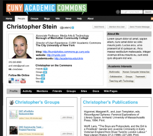
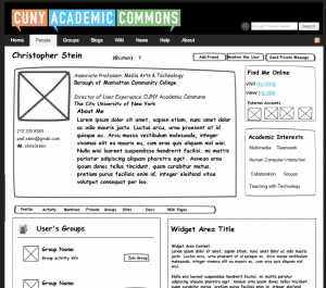
The first verision was similar in design and layout to the homepage but with a member’s information. Here’s a look at a couple of those designs:
Several other iterations around this basic idea were produced and the team chipped in with feedback. This basic iterative process of doing work, getting feedback, making changes and getting more feedback, is part of pretty much everthing we do on the Commons. With a lot of great feedback it became clear that this direction was not working and three central directives on how to change it emerged.
- Focus more on the content the member creates. These were all of the new features: about me, positions, publications etc.
- Remove as much Commons-related material as possible. Even the Commons header, logo and navigation were on the table.
- Simplify the design. The look should be clean, professional and attractive.
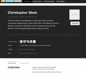
With these directives in place it was back to the drawing board and it soon became clear that the new features would need a page of their own with a design and layout that diverged from the rest of the Commons. In February of 2013 the design that is essentially what is in place today came to life:
Because of the interactive nature of the new features, this was created as a prototype with working web pages using dummy information. If you’re interested you can see some of that work here.
A few tweaks later, this prototype became the blueprint for the development team who took the reigns for the next round of iterations. Over the next six months they accomplished the difficult task of bringing the the prototype to life.
One of the more difficult aspects of the development was creating the widget system that allows people to add in widgets for the customizeable sections (Education, Publications, Positions etc.). Not only did they make this work for the currently proposed sections, but they also created a system that allows for creating new sections and will eventually be able to be pushed back out to the BuddyPress development community to other sites create their own custom and customizeable profiles.
After a few rounds of testing and development we were finally ready to release the new system for the start of the fall sememster.
The Future
As much work as has gone into what you see now, we’re not done and there are more improvements in store. You will have more fine-grained control over the formatting of the content on the page, what kind of content appears and the overall design of the page. We are also working to make the interface more intuitive and simple to use.
There is another part of our development lifecycle I’ve not yet mentioned. Feedback from you, the people who use the Commons. Now that the changes are live your feedback on the changes is vitally important to us and greatly influences decisions we make about what to focus on going forward. We welcome any feedback, positive or negative, and to be frank, we don’t get enough of it.
We really do hope it will become an integral part of how Commons members present their academic lives to the world. If you haven’t explored the profiles already, please do and please drop us a line and let us know what you think.


